How to present your data?
There is more and more data in companies every day – from sales statistics to employee satisfaction scores. It is easy to get lost in all these numbers. There are several softwares which make data analysis easier, for example SPSS, R, Stata. Excel also offers more and more opportunities to organize and analyze data. The question is how to choose the right way to
understand and present your data?
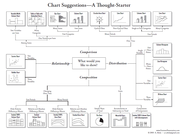
It is easier to understand data when it is visualized. One chart can at the same time present a lot of data and be easy to understand. In the last decades, data visualization has progressed quickly and now it is possible to choose between dozens of charts: bar, column, pie or line charts, 2D or 3D, stacked or separated etc. A poorly constructed chart can create a lot of confusion. There are several instructions how to choose a right graph. One of those is presented on illustration 1. Illustration 1. Chart suggestions (Abela 2009)
The main factor for deciding which graph to use is the nature of data. With cross-sectional data it is useful to construct pie and column charts. When it is necessary to illustrate changes over time then a line plot should be preferred. Another important factor is the amount of factors and categories. When there are many elements (data points), then line plots should be used. When there are a few data points, bar and column charts are suitable.
It is possible to design the chart according to your preferences – change colors, add pictures and logos. It is important to remember not to illustrate your charts too much. The focus should be on the data and the chart should be easy to read. Therefore, it is useful to add data labels with category names and values to every line, sector, column or bar. Charts are useful to illustrate your data and make it easier to follow reports and presentations.
Virve Kass


Write first comment